For this conference I had to design a motion graphics template and package for an external production company to execute for the live event. This includes logo animations, stage session cards and transition templates.
Clip of an Onstage Session Transition. Using the transition and session animations designed by me.
I started with the logo and logo mark animation, so that I could reuse the shapes and movements from the logo throughout the motion treatments. The logo had a colorful rainbow version, and also solid black + yellow versions. I decided to start the animation with the rainbow version and transition to the solid color mark so that the end state (solid color) could work on any background it might end up on.
After experimenting with a few spiral and scaling effects, I settled on two main logo mark treatments to present, shown below. The first (A) using a cascading path trims around the circle combined with some rotation, and the other (B) using some offset scaling effects and “bouncy” key frame settles. We ultimately went with choice A, which I agree with because I like symbolism of the upward motion of the arrow animation and because choice B felt a little too busy.
Skift Global Forum 2024 Logo Mark Animation Tests. Motion graphics designed by me. Logo mark art designed by Beatrice Tagliaferri.
We ultimately went with choice A. for the logo mark, which I agree with because I like symbolism of the upward motion of the arrow animation and because choice B. felt a little too busy.
Skift Global Forum 2024 Full Logo Animation. Motion graphics designed by me. Art designed by Beatrice Tagliaferri.
Different color schemes would be cycled through as the event moved on. Specifically, there were 4 different looks: red, yellow, purple, and blue treatments.
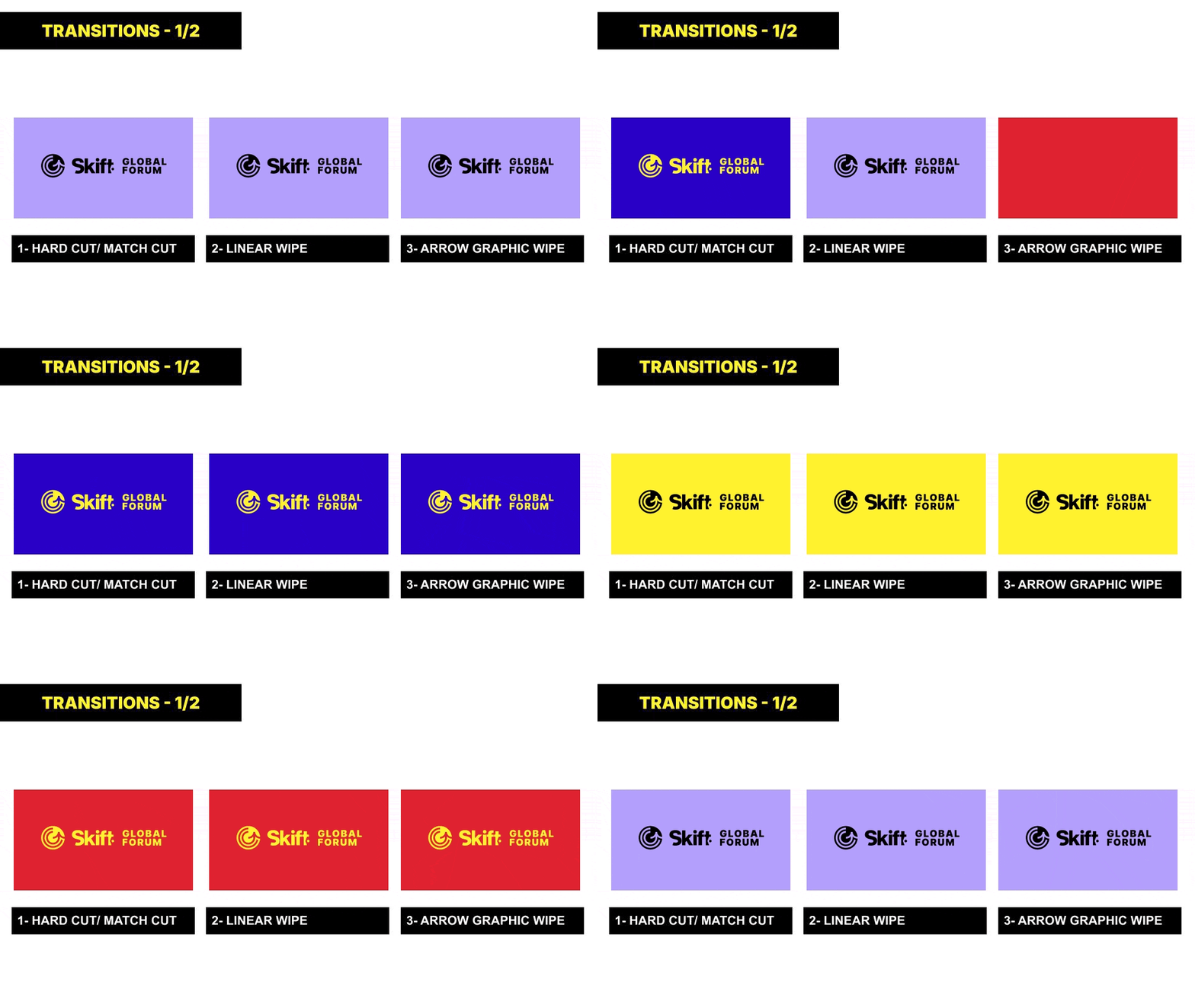
Because the color scheme would be shifting from session to session, I wanted to establish clear transitions for the production team to use so that there were never dissolves or other transitions that might result in colors blending unintentionally and creating off brand moments.
I used the arrow and bullseye elements from the logo mark plus a straight forward hard cut and linear wipe to come up with a set of 6x transitions that were used during the production
Skift Global Forum 2024 Transition Guidelines 1 of 2. Motion graphics and guidelines designed by me.
Skift Global Forum 2024 Transition Transition Guidelines 2 of 2. Motion graphics and guidelines designed by me.
Forum Session Scenic Progression Example Animation. Motion graphics designed by me. Art designed by Beatrice Tagliaferri


